Pure CSS Scrollable Table with Fixed Header (1)
My goal was to create HTML/CSS structure that represents: a scrollable table with a fixed header. (FF/IE6-7)I did it before (see the site that I was the author: click on 'Schedule' from the main site), but did not think about creating the generic layout for such structure.
There are as minimum 2 main ideas how to do that:
1. use an ovefflow-y:scroll/auto for the tbody html table element;
2. use a position:absolute for the thead table element.
After short investigation (1st idea, 2nd idea) I got conclusion, that these ideas themself are mistakes. Why? Because they try to hack the HTML table structure (that is built in the different way for any browser), instead of adapting the existing structures to this goal.
My idea is very simple: to use 2 html structure (div/div, div/table, table/table) and to connect them horizontally. I have found that the more stable structure is 'two tables' one, but the structure that uses the DIV for the header and the TABLE for the table body has a clear markup and is the fastest way for redesign/reuse.
My main question and problem was: how to work with a scroll bar?
This structure must use the overflow css statement, but I realize that all browsers support the 'oveflow' in their own ways. For example: IE6 adds the scroll bar to the width of the scrolling structure, Opera just in the last versions starts to support the overflow-y, IE7 represents the overflow:auto in the not correct way.
One solution is: to use overflow-y:scroll, but this structure will looks not natural if the height of the table will be less than the predefined height (no scroll bar).
I am going to investigate two very similar solutions that use a overflow:auto, and the third one that uses a simple javascript code for dynamically supporting such css structure.
There are several restrictions:
1. the DOCTYPE must represent a standard mode.
2. this structure must have fixed width. That is not too bad, but is a restriction.
3. all column must have fixed width, except of the last one. (With a bit of 'javascript' code I can avoid this restriction. I'll show it on the next page).
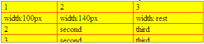
Let me start from creating the scrollable table body. I specially use different backgrounds and border colors for all elements. For the most important CSS statements I use a <strong>font-weight</strong>.
Scrollable tbody markup
<div id="table_wrapper">
  <div id="tbody">
    <table>
      <tr>
        <td class="td1">1</td><td class="td2">2</td><td class="td3">3</td>
      </tr>
      ... more rows here
    </table>
  </div>
</div>
CSS
  #table_wrapper{background:tomato;border:1px solid olive;float:left;}
  #tbody{height:80px;overflow-y:auto;width:400px;background:yellow;}
  table{border-collapse:collapse; width:100%;}
  td{padding:1px 5px; /* pixels */
      border-right:1px solid red; /* to avoid the hacks for the padding */
      border-bottom:1px solid red;}
  .td1{width:100px;}
  .td2{width:140px;}
  .td3{border-right-width:0;} /* optional */
Note: the columns from 1..last-1 must have a predefined width.
| 1 | 2 | 3 |
| width:100px | width:140px | width: rest |
| 2 | second | third |
| 3 | second | third |
| first | second | third |
| first | second | third |
| first | second | third |
| first | second | third |
| first | second | third |
| first | second | third |
| first | second | third |
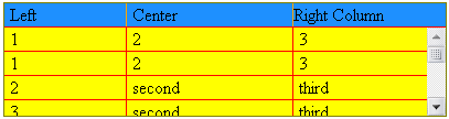
Start to build header:
<div id="table_wrapper">
  <div id="header">
    <div id="head1">Left</div>
    <div id="head2">Center</div>
    <div id="head3">Right Column</div>
  </div>
  <div id="tbody">
    <table>
      <tr>
        <td class="td1">1</td><td class="td2">2</td><td class="td3">3</td>
      </tr>
      ... more rows here
    </table>
  </div>
</div>
CSS for the Header
  #header{width:400px;background:DodgerBlue;border-bottom:1px solid red;}
  #header div{padding:1px 5px;float:left;border-right:1px solid orange;}
  #header #head1{width:100px;} /* the same as td1 */
  #header #head2{width:140px;} /* the same as td2 */
  #header #head3{float:none;border-right-width:0}
Note: padding-left/right and width of the header columns.
    The width of the #thead and #tbody is same.
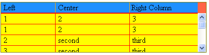
FF3
| 1 | 2 | 3 |
| 1 | 2 | 3 |
| 2 | second | third |
| 3 | second | third |
| first | second | third |
| first | second | third |
| first | second | third |
| first | second | third |
| first | second | third |
| first | second | third |
| first | second | third |
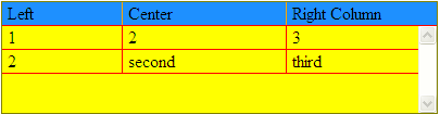
IE6 (image)
IE7 (image)
Opera 9.63 (image)
As you can see, there are several problems that can be solved (or not) only with extra css statements (we call them 'CSS hacks'). IE6 There are several ways to make IE6 works in the same way: 1. make the #header width 400px + 17px (15px the scrollbar + 2 pixels borders). * html #header { width:417px; } 2. make the #tbody width: 400px - 17px. * html #tbody { width:383px; } 3. make the background-color of the #table_wrapper and the #header with same color! #table_wrapper {background:DodgerBlue;} IE7 The IE7 table is scrollable (mouse wheel) but the scroll bar is absent. 2 ways to work around: 1. *:first-child+html table{width:383px;}. In this case the table without a scroll bar will look terribly. 2. *:first-child+html #tbody{overflow-y:scroll;overflow-x:hidden;} I'm losing my main idea, but this code makes IE7 output compatible with the rest of the browser outputs.IE7 (image)
Opera Only last version of the Opere supports the overflow-y css statement. Use: html:first-child #tbody{overflow:auto;} This css hask solve this problem.
Note: our padding does not work for the last column of the header.
Small work for the markup:
    <div id="head3"><span>Right Column</span></div>
and CSS:
    #head3 span{padding-left:5px;}

Also we should not forget, that the scroll bar occupated 17px our last table column,
and decrease (not in the IE6) the width (for a content) of the last column.
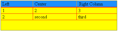
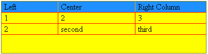
The last question is: what wil happen with this structure if the height of the table will be less than our predefined height 80px (no scroll bar)?
If I use overflow-y:scroll for the #tbody I can forgot about this question.
(In reality that is not the truth).
But using of the overflow-y:auto is a more desirable way here.
Together with the width:100% !!! for our table,
(this is the problem for IE7)and the not defined width for the last column !!!
I solved this problem. The last column will occupy the space for the scroll bar.

Now my answer for this question is: nothing wrong!
| 1 | 2 | 3 |
| 2 | second | third |
IE6 (image)
IE7 (image)
Opera 9.63 (image)
Conclusion
1. Use the right DOCTYPE to get standard mode (DTD):
    I use here: <!DOCTYPE HTML PUBLIC "-//W3C//DTD HTML 4.01//EN"
        "http://www.w3.org/TR/html4/strict.dtd">
2. The width of the table (div#tbody) must be fixed,
   and must be enough as minimum for the header.
   (unfortunately an enough is a "good meagure" until it is "enough").
3. The width of the columns must be fixed except of the last column.
   (you can see how to work around of this problem: static header with javascript).
4. The paddings for TD and the HEADER DIVs shoud be specified in the pixels,
   and have to be with same quantity.
   (in case of usege the em - the font-size must be same).
5. The height of the div#tbody must be fixed.
6. The div#tbody has to use overflow-y:auto.
   See the solution for IE7/Opera above. Safary works correct.
7. Use border-left-width:0; for the first column of the table
   in order to avoid the hacks for a padding.
8. For IE6, the background of the 'div#table_wrapper' and 'div#header' must be the same.
9. Usage of the <colgroup> for the more clear markup - kills this structure (quirk mode).